


A shared product foundation
Workspace structure, interaction patterns, the design system and the brand became one connected foundation. Different apps share the same product logic while serving the needs of different roles.
Case study · 2024–2026
A multi-module workspace where teams manage tasks, records, files, communication and internal operations in one connected system.

Appsatile brings separate business tools into one workspace.
Growing teams often run their work across many disconnected tools: one for chat, another for tasks, others for finance, property records and documents. Each tool has its own navigation and logic, and people end up copying data between them.
Appsatile replaces that patchwork with one connected environment. Every app (tasks, finance, property, documents, chat) shares the same structure, the same interaction patterns and the same data.
The design work covered the product structure, the core workspace experience (navigation, multitasking, views, search, density and the context sidebar) and the design system and brand every app is built on.
The work was done in close collaboration with the founder, who acted as product owner and, as an experienced user of business tools himself, as an expert user. Research drew on people already using an early MVP. That MVP was not developed further: it proved the idea, and the team decided to build a new product on what its users had shown.

The hard part was not any single screen, but keeping one product coherent as it grew.
The platform had to host many apps, each used by different roles. A property manager, an accountant and a team lead may open the same record, but each needs a different level of detail, different actions and a different path through it.
The structure had to stay consistent across apps, yet adapt to the task in front of the user:
How do you make a complex business platform feel like one product: easy to learn, flexible for each role, and structured enough to grow?
Before the screens, the product needed a model that every app could follow.
Every screen answers three questions at once: where am I, who is acting, and what am I working on. None of them works alone. The product is built on where they meet.
Screen · all three
The right tools, for this person, on this record, in this place. Every app is built on this.
For example: Anna gets the London view, an Approve button and the invoice history in the Pilot.
Access
Place + Human. What this person can see and change in this place.
Actions
Human + Object. Which actions this person gets on this record.
Context
Place + Object. Where the record lives and what it links to.
Screen
All three. The right tools, for this person, on this record, in this place.
Every app plugs into the shell through this model, so a new app inherits all three answers instead of inventing its own. Because the content area and the Pilot share it, the Pilot knows which tools to show for whatever object is open.
The platform was planned as two environments on one foundation: the Business environment, where teams do daily work, and the Studio, where builders define new apps, data models and workflows without code. This case covers the Business environment. The Studio was a team effort and reached concept and mid-fidelity stage.
The workspace is built around four persistent areas, each with a clear role.
This structure stays consistent across the platform, so users can move from finance to recruitment, documents, tasks or operations without relearning the interface.
Navigation works on two levels: moving between apps, and moving inside app content.
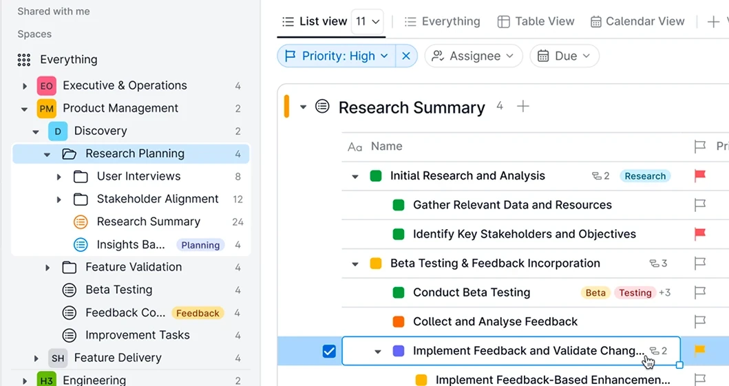
The compact navbar keeps the main areas always available. When needed, it expands to reveal deeper structures such as folders, files, task lists, records and nested sections.
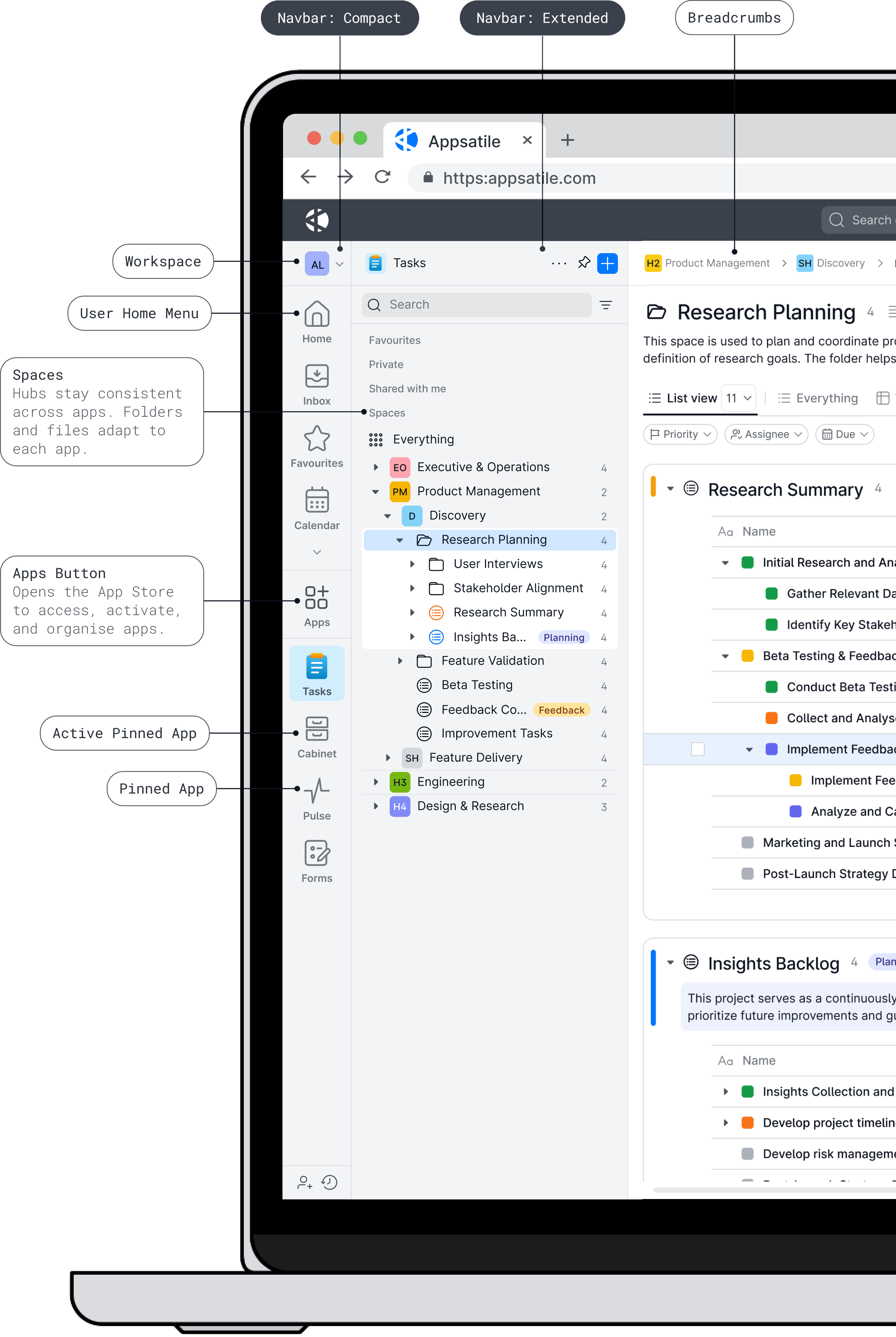
Breadcrumbs help users understand where they are. Pinned and current levels keep frequent locations close, so users can move through complex structures without losing orientation.
The main navbar also switches between app-centric and hub-centric modes, so the same navigation serves people who think in tools and people who think in places.
Decision: pinned and current levels sit at the top of the extended navbar. User feedback showed that people moved between the same few places all day, and the design logic supported it: with so much work happening deep in folder structures, keeping frequent places one click away proved very useful.
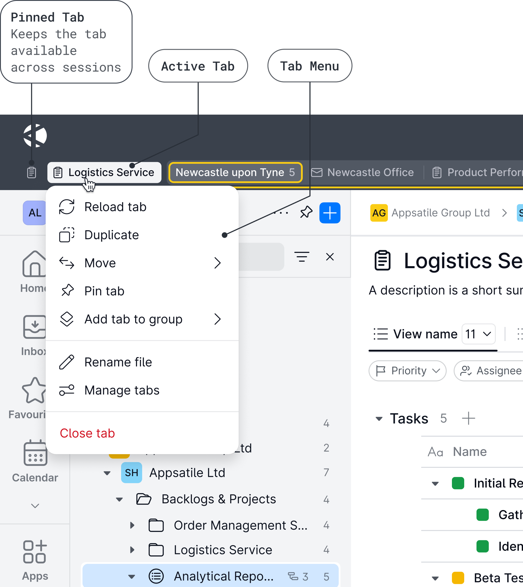
The top bar keeps global tools available from anywhere in the product.
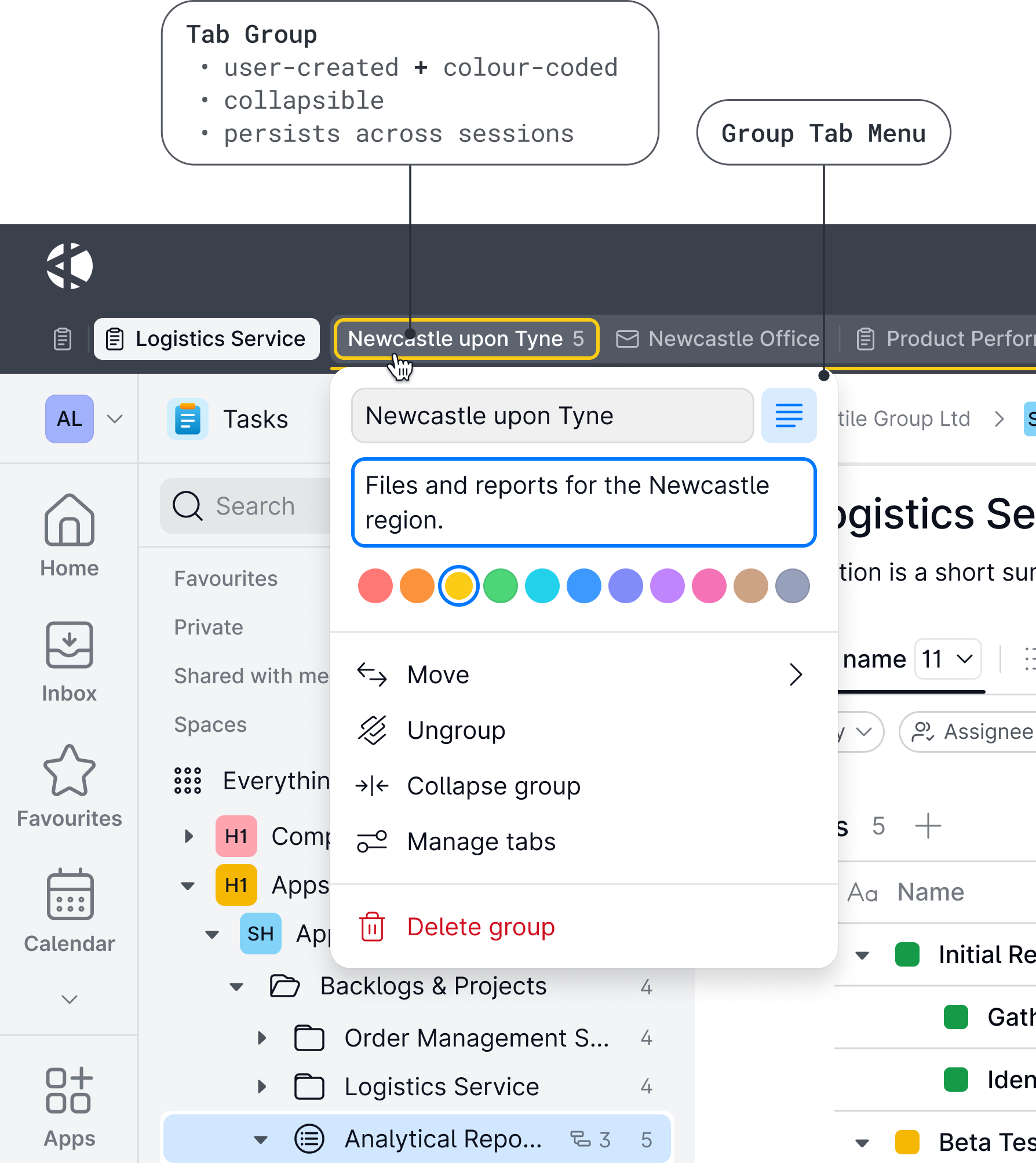
Users often work across several apps at once. Each open window appears as a tab in the topbar, so users can organise them and switch between them in one click. Each tab keeps its state: what was open, the filters applied, the scroll position. Switching doesn't reload the page or send the user back through folders. The tab area collapses to save space and expands when the user needs quick access to everything open.
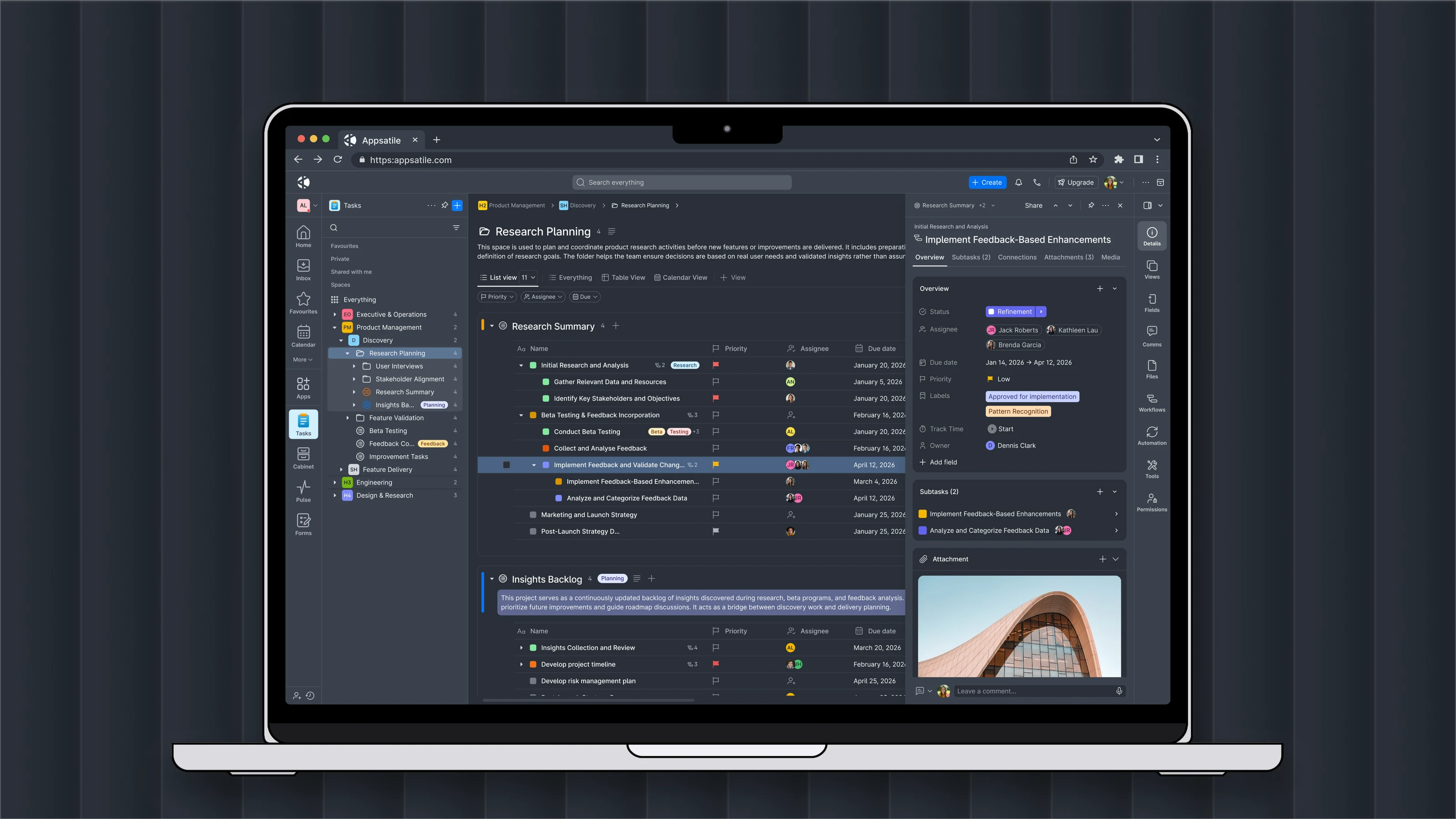
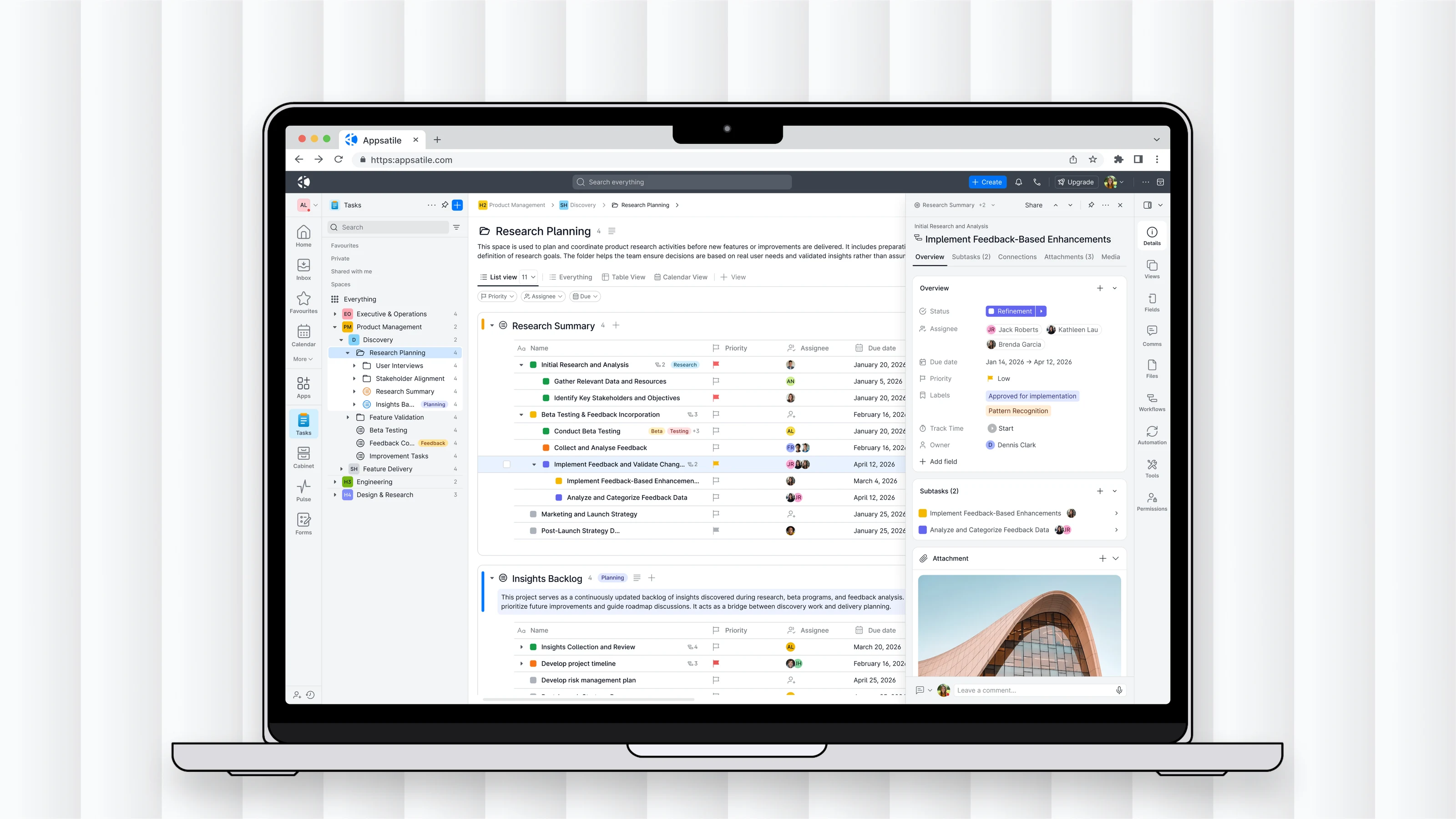
The content area shows the same records in the view that fits the task: three views over one dataset.
Switching view keeps the shared context. Filtering, sorting and the actions for the current task stay next to the data instead of buried in menus.
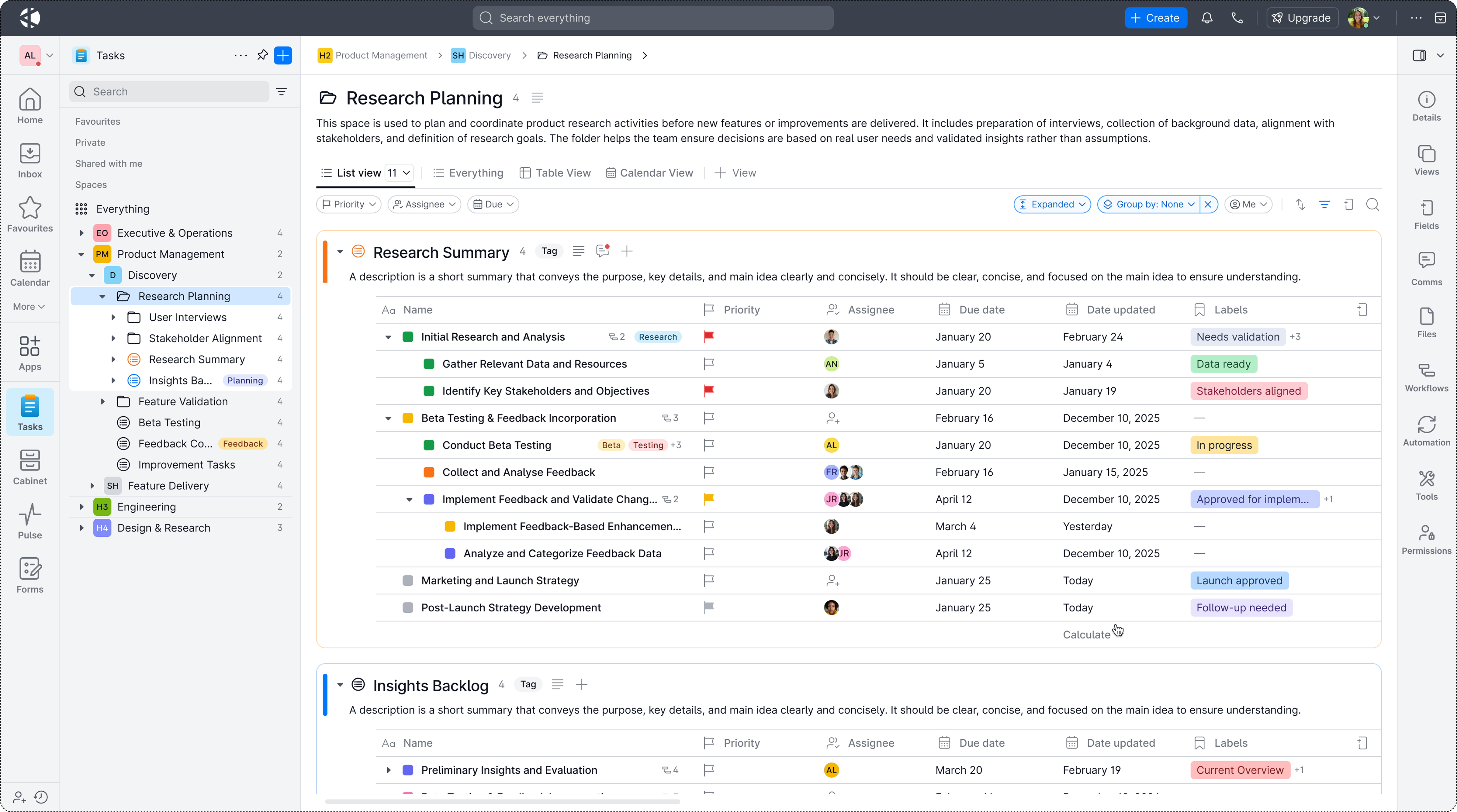
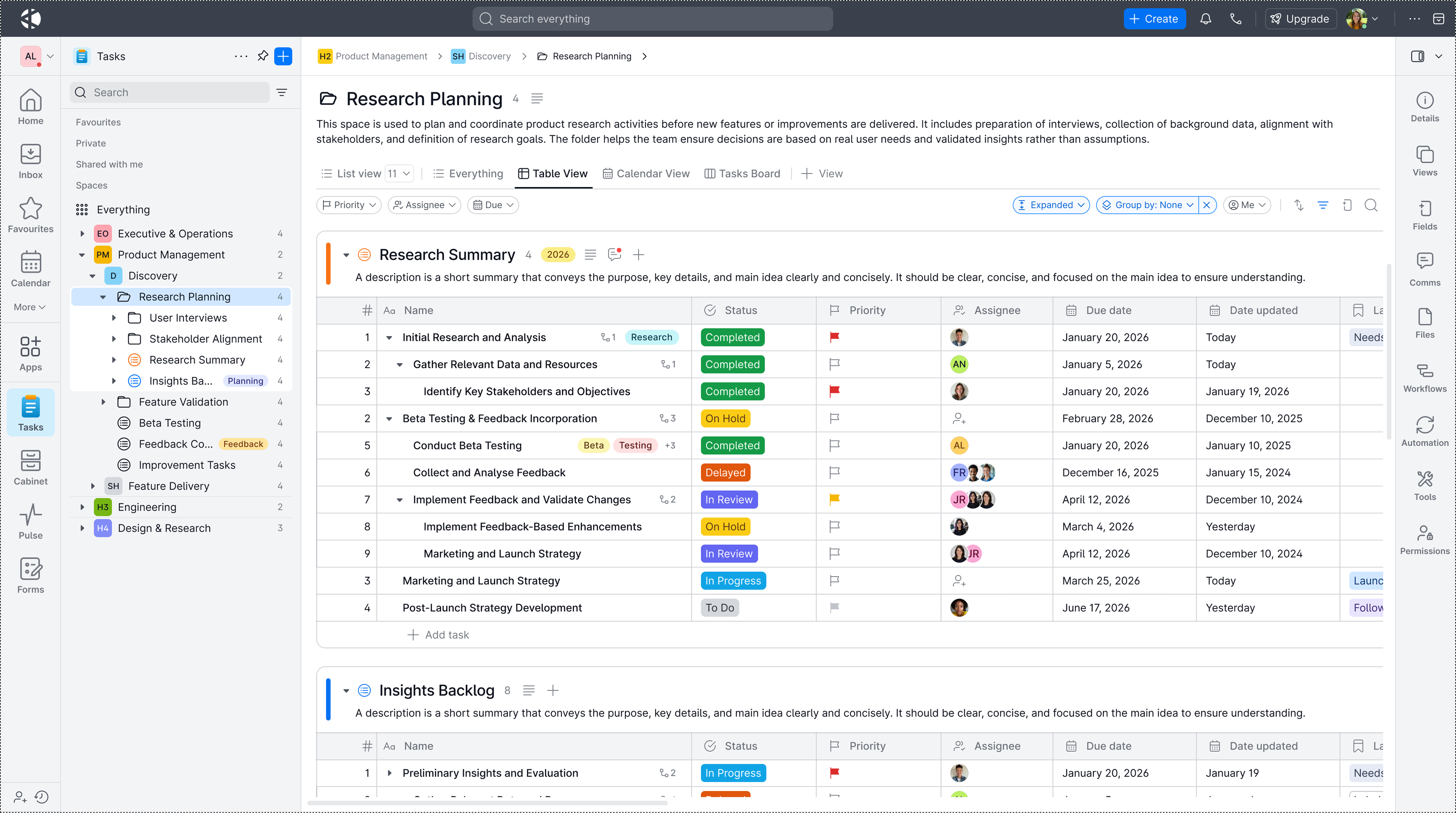
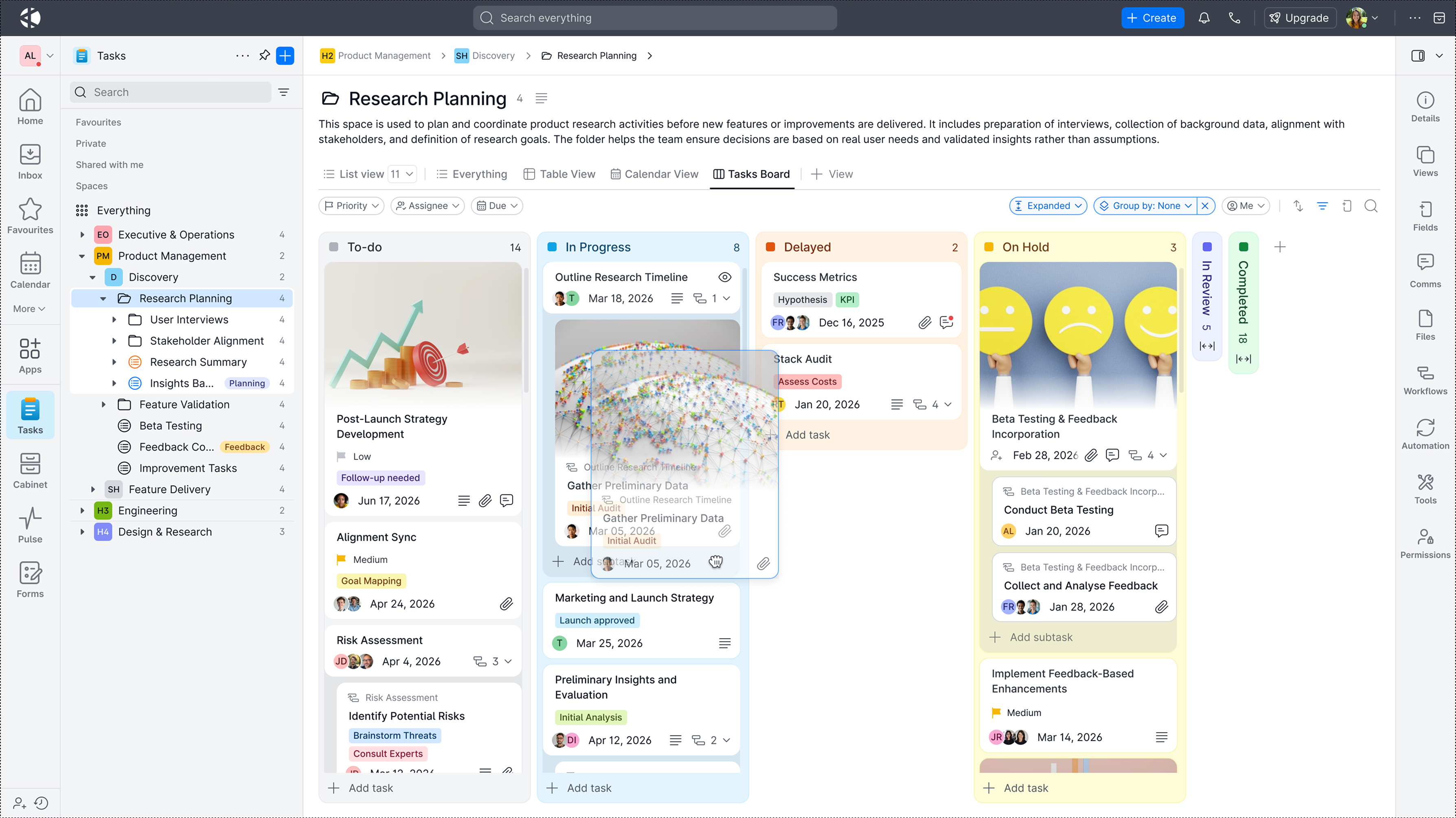
User interviews drove one decision in particular: people didn't just want to filter, they wanted to keep their full setup – columns, order, sorting – and return to it. So a configuration persists instead of resetting.
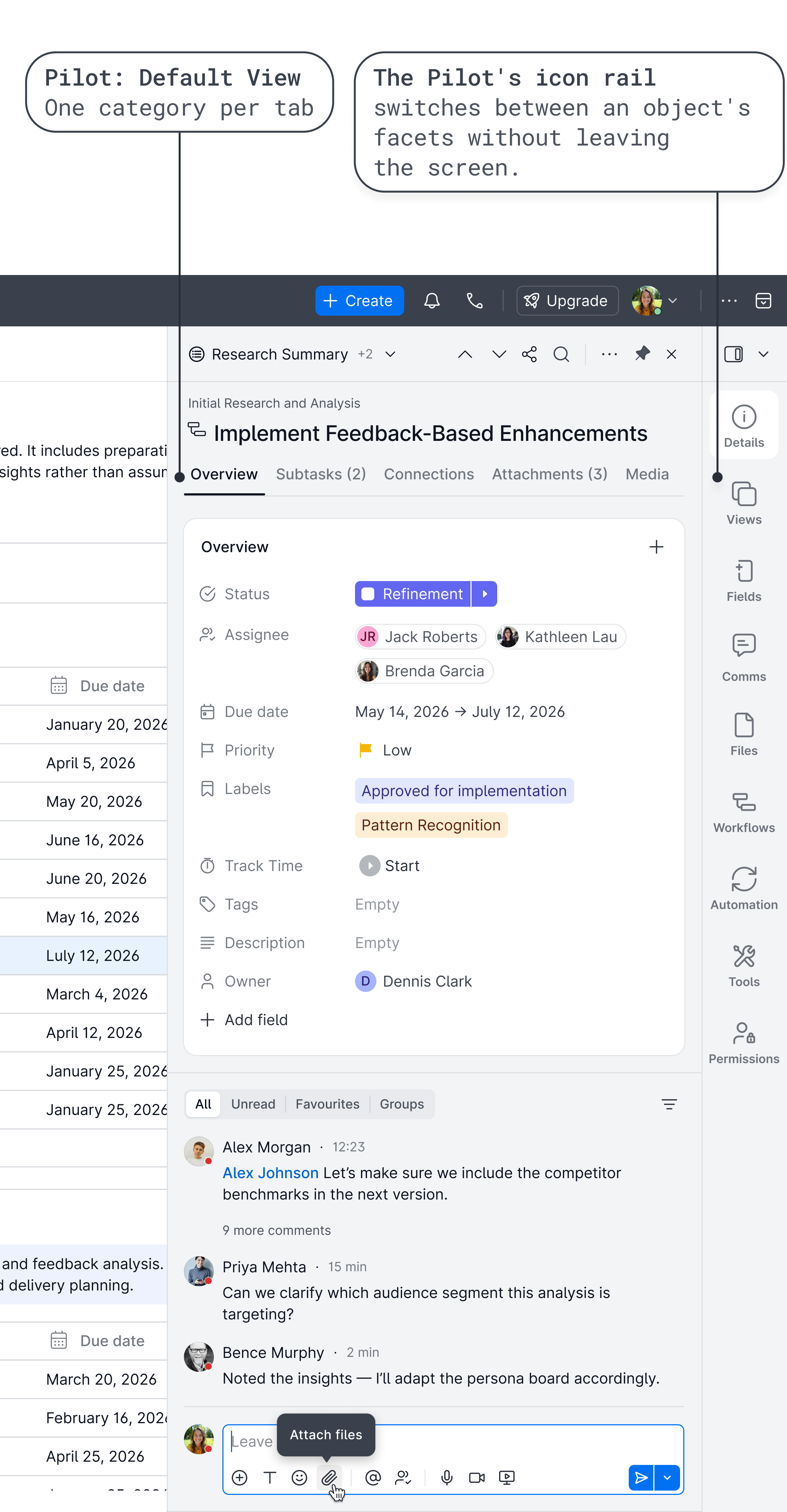
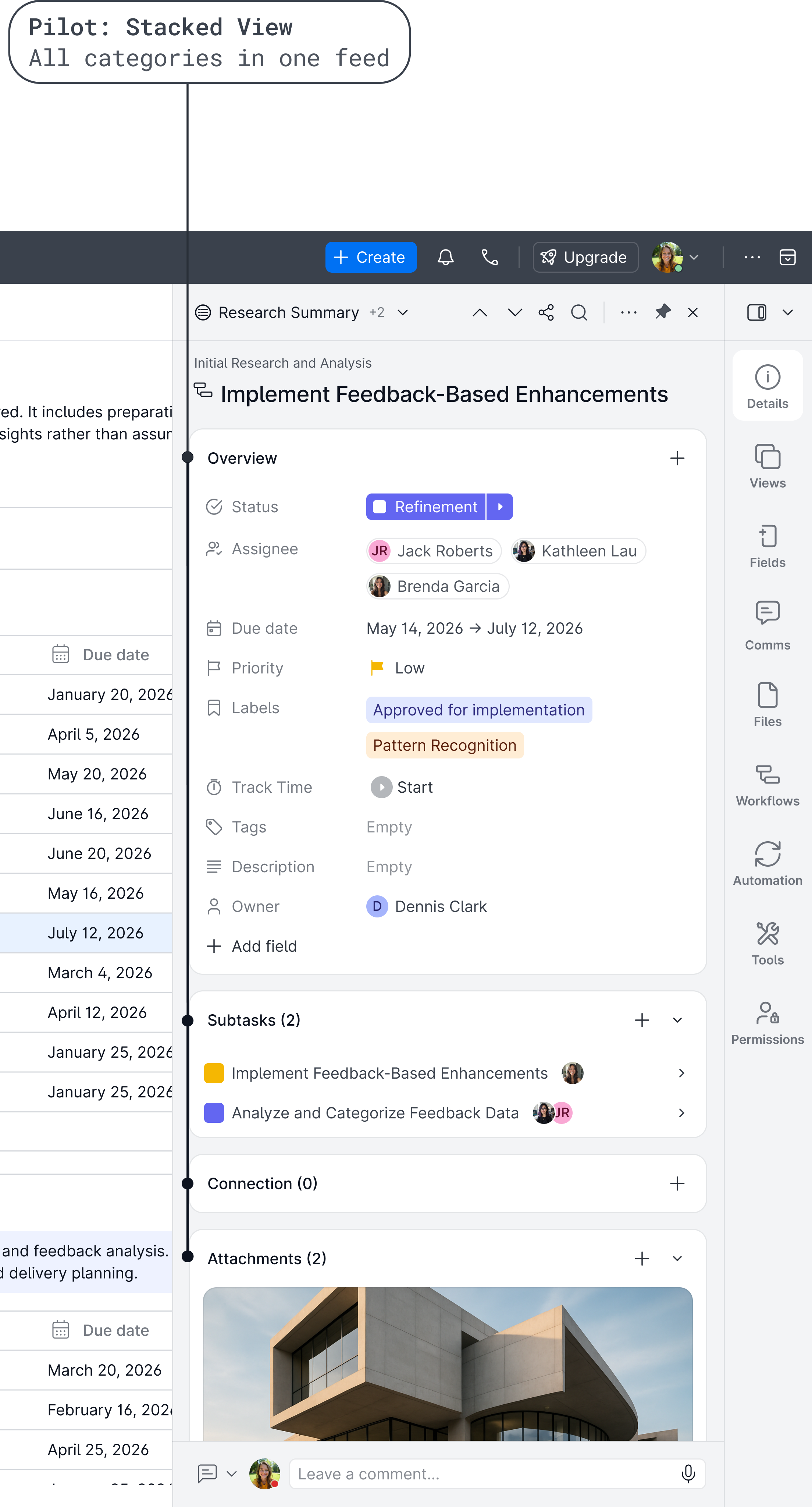
The Pilot is the right-side context layer for the selected record. Opening a record there instead of in a new tab keeps the tab bar for files and views, and gives every record one consistent place.
It holds the record's details, custom fields, comments, linked records and related actions. It is also the single place for an object's settings, properties and permissions, so admin controls never crowd the main workspace.
Decision: a record opens in the Pilot, not in a new tab. The list or board stays in view, so users keep the context: they see where the record sits while they work with its details. A side panel for record details is an established pattern in the tools people already use, so keeping it meant there was no new habit to learn.
Search was built into the workspace at different levels, so users can find information from the place where they are already working.
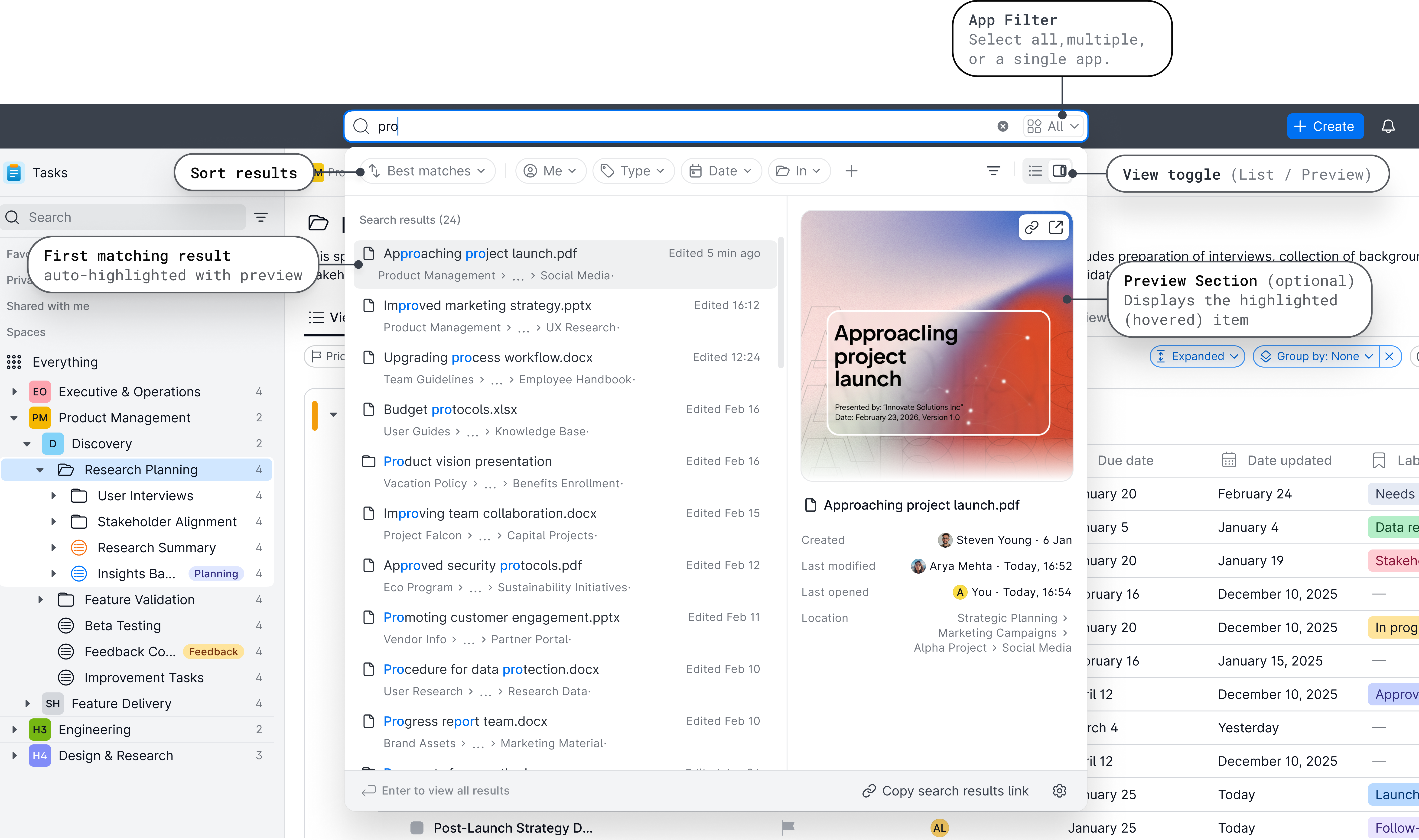
This keeps search close to the current task and reduces the need to move through modules manually.
The platform needed to support both high-volume processing and careful review.
Some users work faster with compact records, dense tables and shorter scanning paths. Others need more space for reading, comparison and decision-making.
 Share your project
 Emma Wilson
 Olivia Taylor
 Ruth KimAALLaura HarrisAAMAndrew Martin
 Jacob JacksonBBDBetty DiazRRWRaymond WilliamsJJRJennifer Rodriquez
 Stephanie BrownJJDJerry DavisAALAnna Martinez

 My workspace

Four density levels let each user decide how much the workspace shows at once. Compact suits people processing records all day, such as accountants. Spacious suits people reviewing and deciding, such as managers.
One mode variable, Component Size (SM, MD, LG, XL), drives spacing, typography, icon size and component proportions together, with Medium as the default. Hit areas are protected separately from visual size, so even the most compact mode keeps every control easy to click.
To make many apps feel like one product, consistency had to live in the system, not in discipline.
The system holds 1,100+ tokens in three tiers (primitive, semantic and component-level) across 15 variable collections. They cover colour, typography, spacing, radius, elevation and density. One change propagates everywhere, and light and dark themes come from the same source.
Colour shows how it works. 248 semantic tokens in six groups (text, background, action, status, border, depth) sit between components and raw values, named by category, role and state, such as action/primary/hover. Components never use a raw colour, and Brand is a single primitive alias: change it once and the whole product follows.
On top of the tokens sit 70+ components, built atom first: buttons and inputs, then patterns such as lists, modals and search, then the workspace itself: navigation shells and data views.
Icons that follow the text. In a fixed-stroke system, a thin icon disappears next to bold display type and dominates small helper text. Here, icon size and stroke weight are derived from the text style: choose a text style and the matching icon specification comes with it. The library holds 868 icons covering 20+ work domains.
Documentation and handover. Each component page held its behaviour notes, token links and prototypes, and served as the source of truth for developers alongside Storybook. Once a component shipped, its documentation moved to a separate file to keep the library fast.
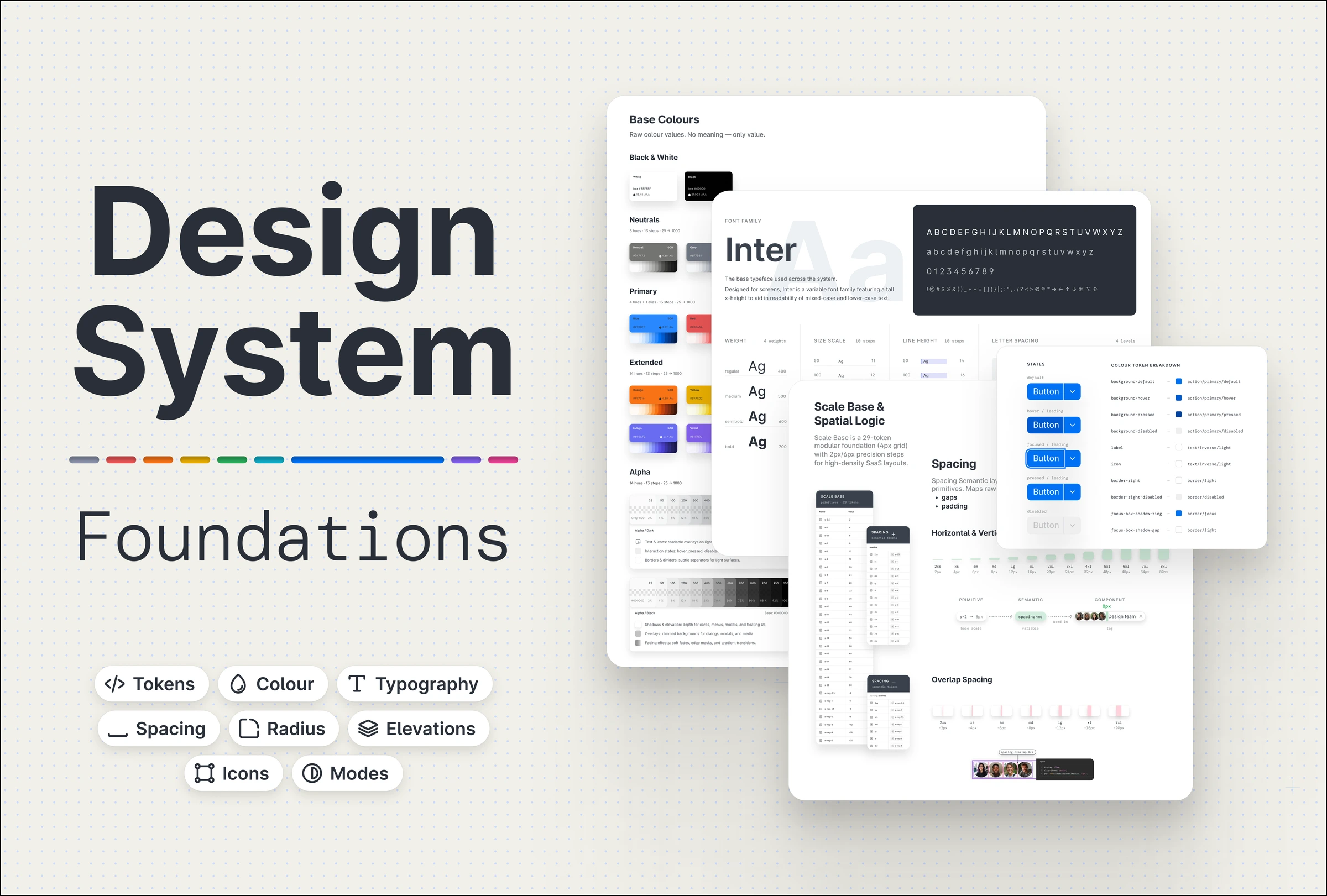
Full breakdown on Behance
Accessibility starts at the primitives. The atomic components carry it first, so everything built from them inherits it by default:
Behind the main structure sit dozens of smaller flows, each built from the same components and rules.
Identity built into the product.
The logo and colour system were designed alongside the product and tied into the same token layer. Brand colours map to semantic action roles, so identity is part of how the UI is defined, not painted on top. A rebrand becomes a token change, not a manual sweep across every screen.
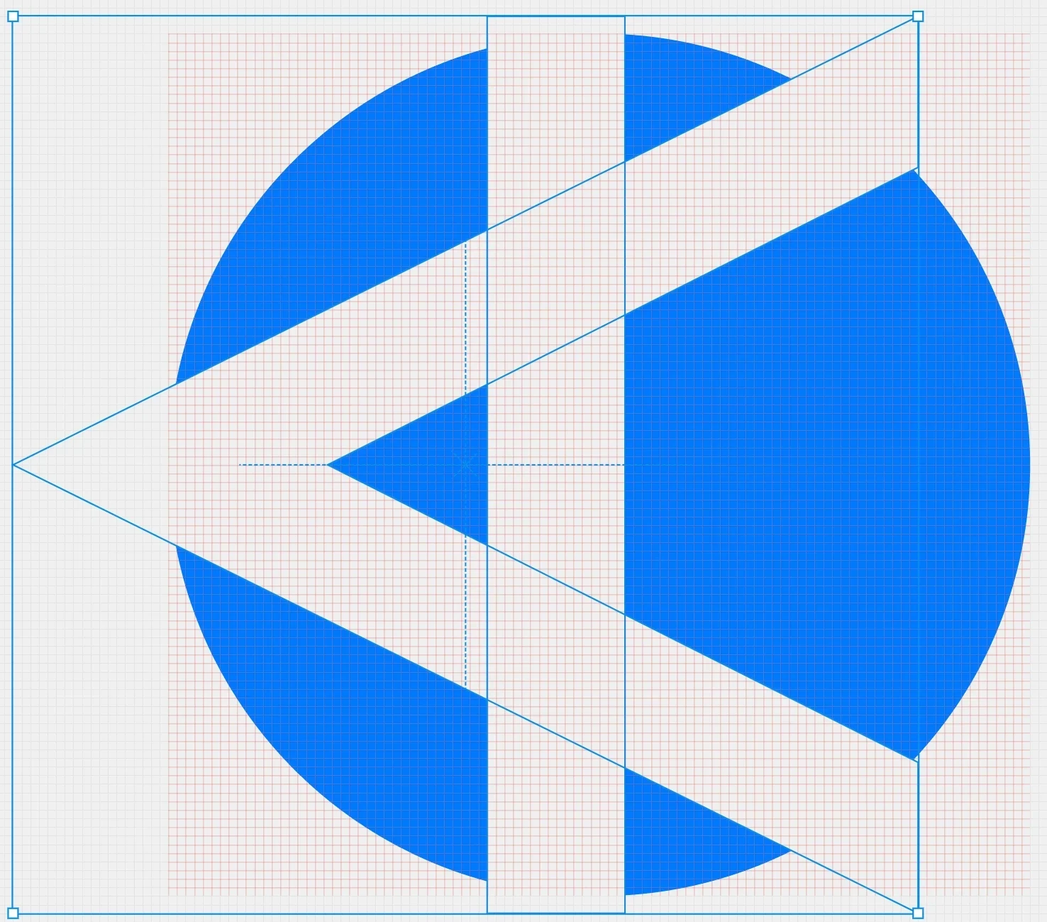
The logo is built around the letter A, referencing alpha as a symbol of beginnings and leadership. Its balanced lines and circular negative space create a clean, flexible mark, while the extended strokes add a sense of movement and openness.
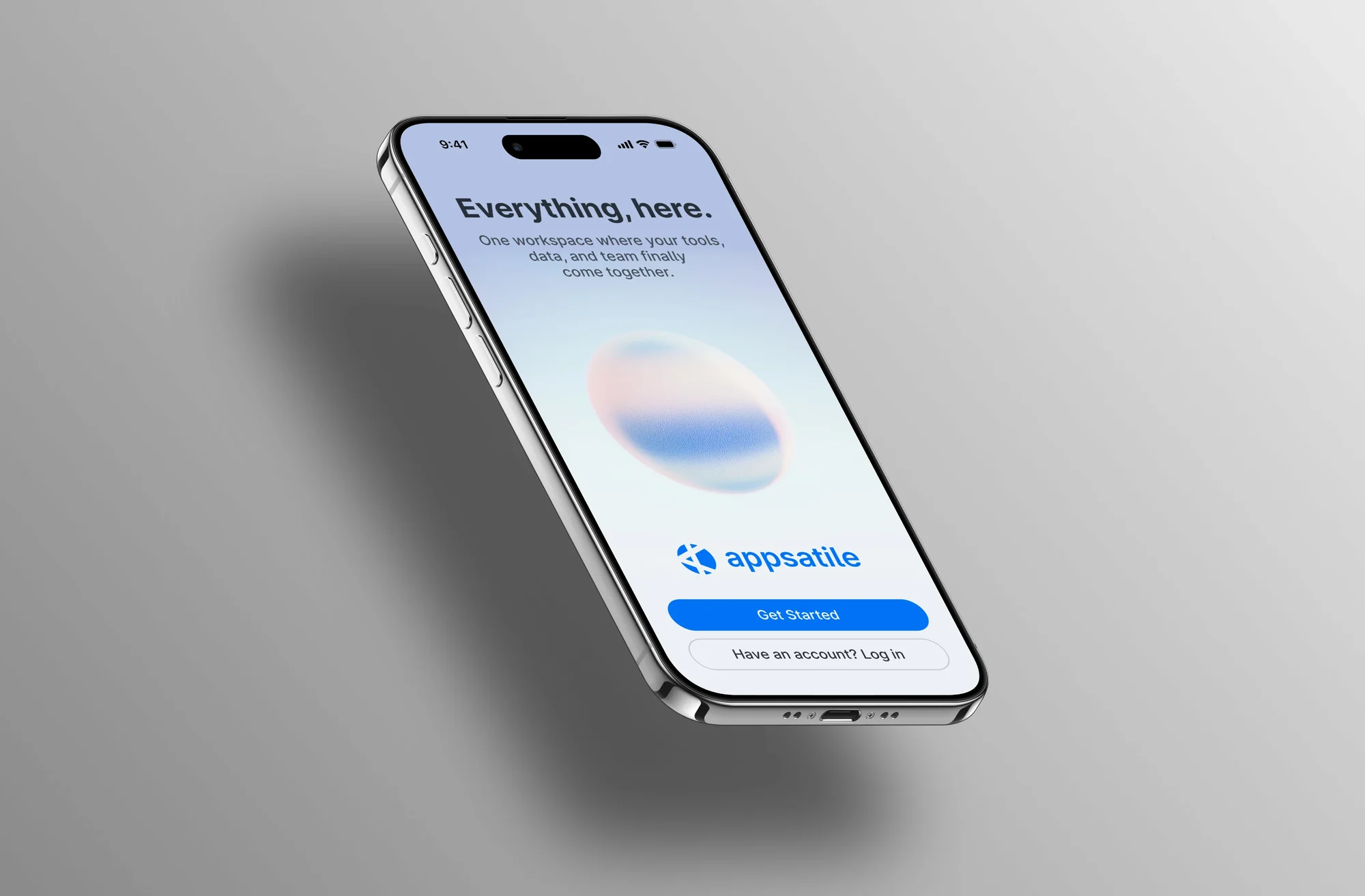
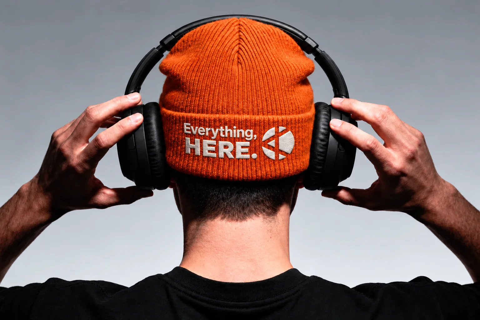
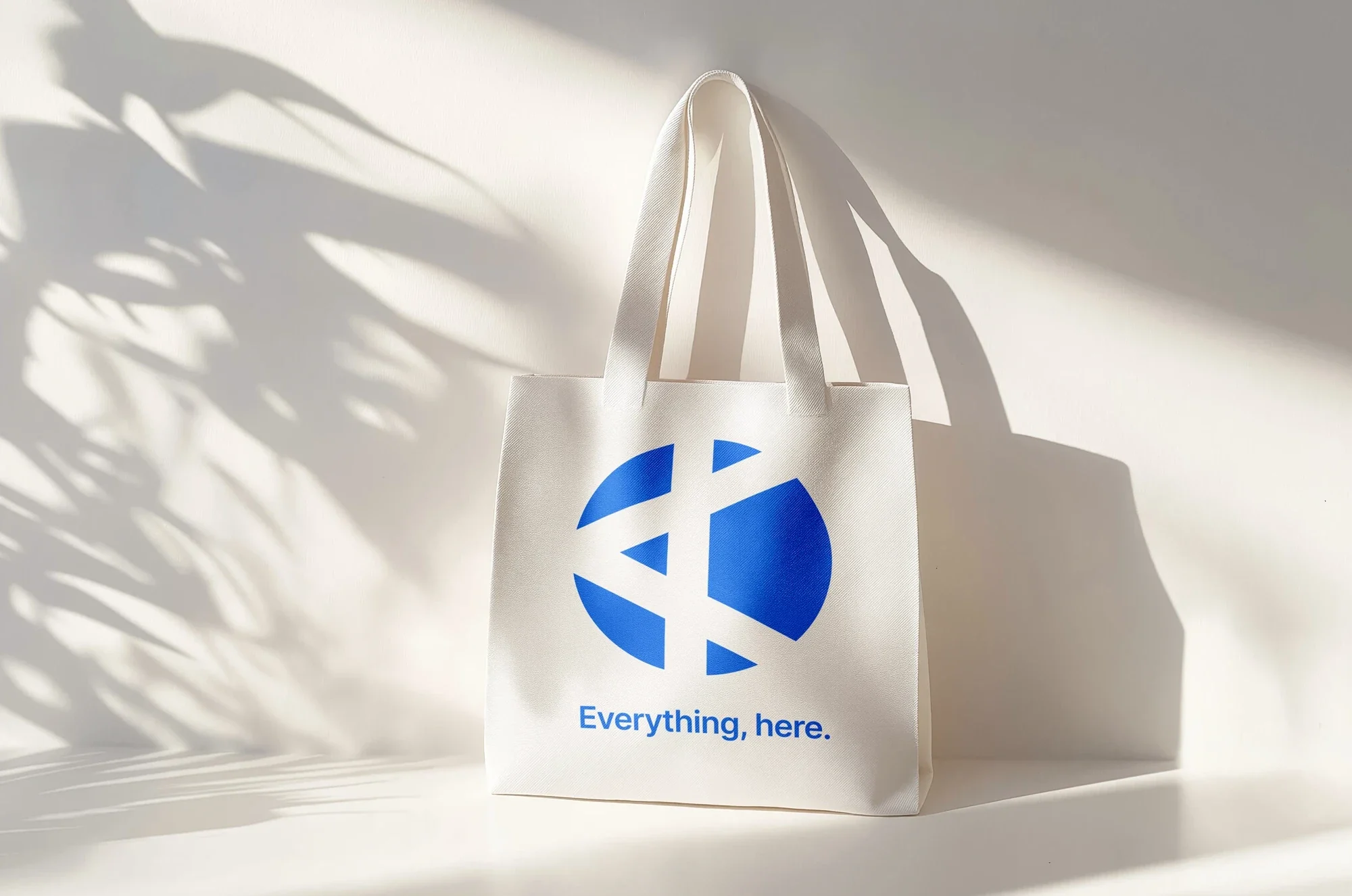
The brand palette is carried through the interface at key interaction points: primary actions, selected states, focus indicators and product identity elements such as the favicon.
Workspace structure, interaction patterns, the design system and the brand became one connected foundation. Different apps share the same product logic while serving the needs of different roles.
Early versions and individual modules were tested by teams in property management, sales and accounts. Their feedback shaped decisions such as saved view configurations, so users could return to their columns, sorting and filters.
The token architecture and component library gave the team ready foundations for new modules, which made ideas quicker to build and test without breaking consistency.
Testing across different business contexts showed shared needs and competing priorities. The lesson: start with one core problem for one type of user, release it, and let feedback decide what comes next.
The full MVP was not released. Business priorities, funding and a fast-moving AI market led to the project closing before launch.
An early product grows best from one core problem, solved well for one type of user and released as soon as it works. AI now speeds up research, design and build, but deciding what to focus on, and what the MVP really is, is still a product decision.
Thanks to the design and development team, and to the founder, for the space to experiment and learn.
“I had the pleasure of working with Daria during her time with us as a UI/UX Designer, and I’m truly grateful for the experience.
Her work was consistently thoughtful and user-led, with amazing attention to detail – translating complex software requirements into clear, intuitive designs that were both practical to build and easy to use.”
Want to reach out?
Have a product in mind? Let's work together.
